 Colour is a complex subject, but for photographers it is certainly worthwhile making the effort to achieve at least a basic understanding of colour theory. How colours are reproduced for various media and environments, such as electronic screens or printing on to paper, is more or less irrelevant for the purpose of this article.
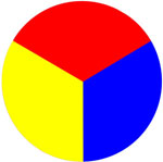
There are three pigment colours which cannot be created by mixing or combining other colours. These are traditionally known as the subtractive primary colours - red, yellow and blue. All other colours are derived from these three primaries. However, it was realized many centuries ago that this trio of colours produced a somewhat limited colour space. In particular, it proved impossible to create bright greens, magentas and cyans. There is consequently an argument for including green as a fourth primary colour. This article is nevertheless based upon the simpler basis of the three "traditional" primary colours.
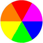
 Secondary colours are formed by mixing the primary colours. Hence, 50% red plus 50% blue gives violet, 50% blue plus 50% yellow gives green, and 50% yellow plus 50% red gives orange. These secondary colours are shown in the diagram on the right.
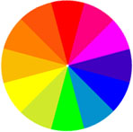
Tertiary colours are formed by the same logical process, this time mixing a primary colour with its adjacent secondary colour. Red and violet produce red-violet (75% red and 25% blue), blue and violet produce blue-violet (75% blue and 25% red), blue and green produce blue-green (75% blue and 25% yellow), yellow and green produce yellow-green (75% yellow and 25% blue), yellow and orange produce yellow-orange (75% yellow and 25% red), and red and orange produce red-orange (75% red and 25% yellow). The tertiary colours have been added to the circle in the third diagram at the lower left.
The presence of colours in an image has a significant effect upon how it is perceived. Strong, dominant colour catch the eye and draw attention to the areas of an image in which they appear. The strongest colours are the three primaries - red, yellow and blue. Wherever they appear in an image they tend to become the focal point of the image, perhaps drawing the eye away from the intended subject. Yellow is arguably the most dominant of the primary colours to the human eye, and any significant area of an image occupied by a reasonably pure yellow will immediately become the focus of attention. However, yellow does not appear too frequently in nature, except in the case of a few varieties of flowers. Most naturally-occurring colours in the yellow area of the spectrum are tinged with browns or greens, and consequently have a less powerful effect. However, photograph a group of half a dozen people, and the one with the pure yellow shirt will dominate the image.
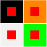
 Red is also very dominant and intense and should be incorporated only sparingly into images where it may draw the eye away from the intended subject. Areas of red tend to leap out of an image, particularly when other colours are subdued or dark. A small area of red can have a disproportionate effect on an image, so incorporate it carefully in to compositions. Notice, in the diagram below, how the red square stands out more strongly from the black background and appears weaker against the orange surround. When surrounded by green, the red square again acquires huge impact as a consequence of the two complementary colours being placed side by side.
Blue occurs extensively in nature. A clear sky is blue and water reflects the colour of the sky, particularly in tropical areas where it is clear and still. The human eye therefore accepts blue as natural and restful. It is sometimes described as a retiring or background colour because that is how our world usually presents the colour to us. Blue is consequently the least dominant of the three primary colours.
As soon as colours are mixed, as in the case of the secondary colours, they all tend to become less dominant and have consequently less powerful effects upon an image. Tertiary colours are even more subdued and much closer to browns and greys to which the human eye gives less attention.


