 The use of strong colours in an image generally requires some management by the photographer if an acceptable result is to be achieved. Uncontrolled use of an area of near-pure yellow or red is likely to cause visual imbalance that views of the image will find disturbing or unsatisfactory. Colour balance is therefore desirable if one part of an image is not to draw the eye. A picture of a red flower against a background of natural green foliage may work well because the eye is drawn to the red areas which is exactly what nature intended. However, a girl in a yellow dress standing next to a bride and groom will deflect attention from the wedding gown and the person wearing it.
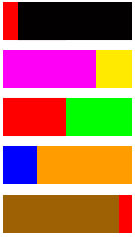
A small area of a strong colour can often be balanced with a larger area of a complementary hue, but a photographer needs to develop an eye for achieving such difficult-to-define balances. Have a look at the examples in the adjacent diagram. Ideally, all the rectangles except the one being examined should be covered. Otherwise the presence of the other rectangles may influence the assessment. Ask whether each rectangle in visually balanced. One can of course argue endlessly about where the dividing lines should be, but the principle of small areas of strong, pure colours balancing larger areas of weaker colours should be revealed.
In the case of the top rectangle, the small area of red still pulls the eye away from the much larger black area. In the second rectangle the smaller area of blue might arguably be seen to balance the larger area of magenta. In the case of the third strip, the two strong and complementary colours more or less balance each other. The red are is actually a little smaller than the green. The blue and orange strip is generally more subdued because blue is a receding colour and the orange is more subdued that the red and yellow primary colours from which it is derived. In the last case, the very small area of pure red may still be seen to overpower the much larger brown area although visual balance is almost achieved.


