Two dimensional images have no physical depth. A photographer should therefore strive to create an illusion of depth by other means, such as the careful use of lighting, contrast, colour, depth of field and perspective. The inclusion of foreground elements in a composition also gives an image a feeling of depth.
 In broad terms more or less any image can be divided into three areas of depth - foreground, middleground and background. Foreground usually incorporates anything that is close to the camera - perhaps within a few metres. Inexperienced photographers often make the mistake of eliminating all foreground objects. They see, for example, a magnificent range of mountains and move to a location that provides a clear view to take their picture. In such circumstances the result is likely to be uninteresting not least because the image will probably lack depth. Everything in the scene is at infinity and so described as background. Most photographers have experienced the disappointment of flat and uninteresting pictures of distant mountains which, at the time the photographs were taken, looked so spectacular and different.
The first step towards addressing this problem is to introduce foreground elements in to the composition. This is easy to do since the photographer is standing on something to create the image, and some part of it can probably be included as a foreground element.. Bending the knees may be all that is required to improve the images!
Almost any foreground object can be used to add depth - rocks, flowers, clumps of grass, a bush or tree, a bench with someone seated on it etc. In the case of landscape photography, a photographer may wish to render everything in an image in sharp focus and hence select a small aperture (eg f/11) and a slow shutter speed. A tripod is therefore commonly used. However, foreground elements do not have to be in sharp focus. The perception of depth may sometimes be enhanced by controlling depth of field to render only the more distant elements of a composition in sharp focus.
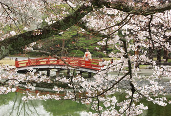
 In the image of the bridge above, which shows the garden at the Byodoin Temple in Uji, Japan, the cherry blossom has been used in as a fairly dominant foreground to frame the person on the red bridge in the middleground. The background of greenery does not in any way distract the eye from the subject of the image.
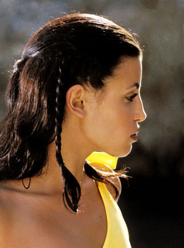
Selective focus is often used in portraiture to throw the background out of focus and render the foreground, the person, in sharp focus. This technique has the effect of lifting the subject out of background detail. In the image of the girl on the right, the model's profile is in sharp focus and forms the foreground, but the background is rendered soft, uniform and unobtrusive by careful composition and use of a large aperture (f/4) to drop it out of focus. Focus is normally concentrated on the eyes of a subject because a human being normally looks at another person's eyes when communicating. A portrait photographer will also seek to keep background detail minimal and unobtrusive. Nothing in the background should distract the eye from the foreground - the human subject.
 Let us now turn the discussion around and look at the effect of including too much foreground material in a composition. Inexperienced photographers often include distractions in pictures of people by remaining too far from their subjects. A child playing on a lawn might typically be photographed with a bright yellow ball lying close to the camera. The first element of the picture that grabs the eye of a viewer is consequently the yellow ball rather than the child. No foreground element should be of sufficient prominence to distract a viewer's eye from the subject in this way. To eliminate such problems it is necessary only to move a couple of steps closer to the child, kick away the ball, or zoom in from the original position by using a longer focal length. In some cases, a picture featuring a distracting foreground can be improved simply by cropping out the distracting element and reprinting the remaining image.
Having established acceptable foreground and background elements, and perhaps also a middleground, it is advantageous to link them together in a way that leads a viewer's eye from one area to another. Landscape photographers search for paths and fences, but countless other techniques may be used. A waterline curving around a coastal bay might be utilized to lead the eye from a foreground shingle beach to more distant cliffs and ultimately the horizon. The shapes of such lead lines can add in large measure to the quality of a composition. It is also possible to use shadows, colours or even the line of sight of a group of people.
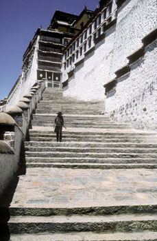
In the image above, which shows the famous flight of steps leading to the Potala Palace in Lhasa, Tibet (and down which the Dalai Lama is said to have driven his old car!), foreground interest is provided by the first two steps and the colours and textures of the stonework, the middleground is occupied by the figure descending the steps, and the background is dominated by the Potala Palace itself. The wall on the left, and the stairs rising in to the distance, provide simple and obvious lines for the eye to follow in to the depths of the image.


