 When composing an image it is all too easy to concentrate entirely upon the subject - the positive space. The subject is probably what caught the photographer's eye and gave rise to an attempt to create a worthwhile image. The rest of the image, the negative space, tends to be given less attention but this may lead to dull and less successful images.
Negative space provides context for the subject - the positive space. It may be used to include environmental detail so the viewer understands the circumstances in which the subject was photographed. How the subject is positioned within the negative space is a very important part of composition. Place the subject in the middle of negative space and the picture may prove dull, but position it according to the rule of thirds and the image may come alive. In some cases the negative space is essential to demonstrate what the subject is all about. A close-up of a small boat in a rough sea might not be very interesting, but show the same boat as a tiny and vulnerable craft in a vast ocean of white-crested waves, and the image may take on a much more evocative and threatening atmosphere.
As with every element of composition, a large element of judgement is involved. If too much negative space is included it may overwhelm the subject and the picture may lose its meaning. The task for the photographer is to incorporate sufficient negative space to define the subject and its context, and so manipulate the attention of the viewer. In many cases most of the negative space may be devoid of detail or sufficiently out of focus to avoid distracting the viewer's attention. In other cases, such as that of a rough sea, it may be in sharp focus and used to provide the all important context alerting the viewer to the danger in which a small boat is caught.
Negative and positive space are perhaps best regarded as having equal importance in composition. The negative space can be used to evoke a particular mood or emotion, but should also give the subject sufficient space to avoid a feeling of overcrowding. Place a subject in an optimum position in negative space and the picture may well work. Place the same subject incorrectly and the image will probably fail. In the case of a portrait, the subject should in most cases have enough space in the frame "to breathe" - ie not appear cramped of jammed in to the frame in an uncomfortable manner. As the area of negative space increases, however, the significance of the subject is likely to diminish. A balance must be achieved.
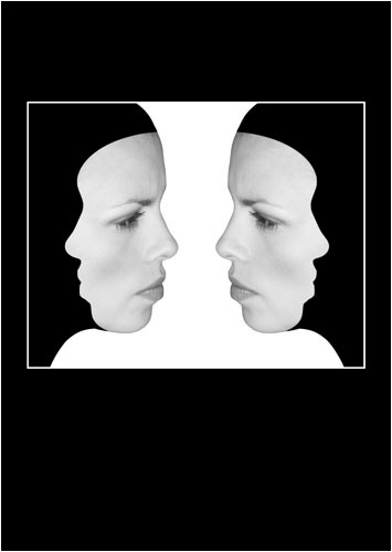
The subjects in images have their own shape and form, and these may be interesting in themselves. However, negative space can also have an interesting shape that in some cases also becomes a focus of interest. In the image below, the model is faced by her own image, and her profile is used to mask out much of her head. However, notice how the shape of the white area of negative space resembles a vase or a pawn on a chess board. The black negative space is also an essential element of the image and is used to achieve the optimum position for the two faces.
Negative space is indeed a powerful tool in composition and can be used to transform the ordinary in to the extraordinary.


