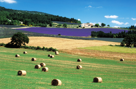
A tour of photographic clubs, and a few evenings spent listening to some club judges, might well convince you that framing and composition were matters for well-established rules. Unfortunately, life is not that simple. The rule of thirds calls for the principal elements in an image to be placed at intersections of the pairs of lines, horizontal and vertical, which divide the frame into nine equal areas. This broad generalization can be inhibiting but must not be completely disregarded. Examination of good images soon reveals that it has some merit. Place the eyes of a subject in the centre of the frame and the result is restful but dull. Put them one third down from the top of the frame, and the composition becomes less symmetrical and more interesting. Position them one third from the top and also one third across the frame and the image becomes strongly asymmetrical. It begins to acquire tension and may need a counter-weight of some sort to achieve visual balance.
 Nevertheless, rules of this sort must not be allowed to control the framing of a subject and hence stifle creativity. Anything can be placed anywhere in an image, and cropping can be done in any way you like. The only requirement is that it works. Don't be afraid to try new angles, go another way or even fail. Experimentation opens doors and that counts for a great deal.
When deciding how to frame your subject, think carefully about what will lead the eye to the centre of interest. Strong lines, implied directions and selective lighting are useful for this purpose. Another worthwhile technique is to use a second frame within the frame of the viewfinder. This isolates and draws attention to the subject. Windows and doors are the simplest examples of internal frames, though certainly not the only ones. Natural vignettes provided by foliage, or even lines implied by composition, are also effective. In the case of close-ups of a person's face or eyes frames may be suggested by hairlines, hats, beards and items of clothing. It is not essential that the face is completely surrounded. Finally, make sure that whatever effect is used is not excessively contrived.
When working outdoors the picture may include a jumble of unwanted and uncontrollable detail, particularly in the background. It therefore pays to know a little about the environment, and to think before plunging in. Stand back and take a broad look at the surroundings. Identify the most interesting elements and those that may support your vision.
A final thought on framing relates to the use of space - an important and often overlooked consideration. Areas that are more or less empty are an acceptable part of an image provided they serve some purpose in the overall design. Indeed, they may be desirable or necessary to achieve scale or balance.


