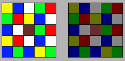
The effect that a colour produces in an image depends upon its brightness, the area it occupies, and its relationship with areas of other colours. Collateral colours, those that are close or adjacent in an image, should be handled with particular care. In the diagram, the central brown square is precisely the same colour in both of the grids. However, we see a quite different colour in each case as a consequence of the the collateral colours.
 It is all too easy to get wrong the use of assertive primary colours such as saturated reds, blues and yellows. They are more likely to fight each other than muted colours, and tend to grab the eye and divert attention from the centre of interest. Colour harmony can be achieved in numerous ways but the most obvious is by restricting the colours in an image to closely related desaturated hues. This enhances appreciation of the subtle differences between very similar areas. For this reason successful images often consist of similar muted tones.
Harmony can also be achieved using contrasting colours although the result is likely to be more striking. Areas of colour of different sizes and strengths can be positioned to achieve an effective pictorial balance, but when they are adjacent they may produce a distracting vibrancy. Similarly, small areas of dominant colours can be used to balance larger areas of more subdued hues.


