Successful images work because they are captured in beautiful light, their elements fit together in a satisfying manner, and ultimately they inform us about the subject. Unfortunately, the attractive attributes that make an image special rarely appear by chance. They are more likely to be measured and carefully arranged. Consequently, there are many aspects of design to consider, including light, shape, form, line, pattern, texture, hue, tone, mood, atmosphere and meaning.
Seeing pictures
To begin with, the world has to be visualized in two-dimensions. A photograph is merely a sheet of paper and has no depth, but must preserve the illusion of a third dimension if it is to be lifelike. Producing a really good two-dimensional representation of form and depth is one of greatest challenges in photographing people. Lighting is the key because visual experience allows us to relate tonal gradation in the flat image to the different ways in which surfaces respond to illumination in the real world. Areas of deeply contrasting light and shade emphasize depth, form and texture. However the gentle curves of the human body are normally best illuminated by diffused light that produces subtle effects. In black-and-white images shape, line, form, texture and tone are principal elements of composition and must be fully utilized to retain depth. In colour images brighter hues tend to advance, so brightness and saturation may become significant.
The edges of a photograph, the frame defined by the viewfinder, also have to be accommodated. Such boundaries do not exist in the environment, but all the elements included in an image have to lie comfortably within these strict limits. A couple of simple techniques help to develop the basic visual perception required. First we can learn to see and analyse shape, in a deliberate manner, independent of its human context. Partially closing the eyes helps to identify the principal shapes and elements in a scene. This diminishes the finer qualities of the light and reduces detail and colour saturation. Peering through a rectangular frame, perhaps formed by the thumb and first finger of two hands, can enhance the effect. Alternatively, just close down the lens aperture and look through the viewfinder.
 The ability to see form in an analytical manner is a little more difficult to acquire, although it is basically only the three-dimensional equivalent of analysing shape. As we have seen, key elements are how surfaces are illuminated and how they absorb or reflect light. Highlights, dark shadows and the infinite tonal gradations between the two extremes must be observed. Also, look at lines and curves, and consider whether they encourage the eye to explore the depth of the image.
 It is worth noting here that the perception of colour is an integral part of seeing pictures. Colours alter balance, create the illusion of form, and suggest shapes and directions. Advancing, strident colours draw the eye, leap out of the picture and subordinate quieter hues. Consequently they are significant in the same way as the physical shapes of objects.
Finally, know your lenses and their limitations. Understanding how they change perception increases control of image design. Telephoto lenses compress depth and enlarge the subject. Distant objects may look closer to the foreground than they really are, reducing uninteresting intervening spaces. Depth of field is restricted so differential focus can be used as an image design tool. Wide-angle lenses increase the impression of depth and scale, but diminish the size of the subject. To achieve a reasonable reproduction ratio the photographer must therefore work close to the subject - perhaps only a metre or so from the person's face. This implies a considerable degree of involvement but often results in entirely fresh perception. Care must be taken not to enlarge disproportionately the features of the face.
Making images
The process of "taking a photograph" is very straightforward provided we require nothing more than a record of little merit. The ability to "make an image" is what qualifies us as photographers. This is not just semantics. It is a fundamentally different approach. Taking a photograph implies that we accept what is available, perhaps just choosing which part of a scene to record. There is virtually no creative input, and consequently little satisfaction. Making an image suggests that there is work to be done - by the photographer. The image has to be designed before it can be captured, and therein lays the creativity.
Begin by considering the proportions of the frame. Compositions suggested by a square medium format frame might be quite different from those suited to the 1:1.5 aspect ratio of 35mm. In the latter case the choice between landscape (horizontal) and portrait (vertical) orientation must also be made. The human form simply portrayed invites the use of portrait format, but be sure always to consider other options including square and diagonal.
The next stage is to make the overall shape of the subject pleasing. Force the eye to regard the human subject as a shape. If the geometry is uninteresting change it in whatever way is appropriate or possible. Try simple movements of the head and limbs, look for diagonal lines and if necessary rearrange the overall shape of the body. Also consider whether perspective, illumination, colour and contrast are such that the illusion of depth will be maintained in the image. If the scene has marked contrast, measure the highlights and shadows using spot metering and add any necessary fill.
Once satisfied with the subject, concentrate on the background. Consider its colour, contrast and detail. Quite small changes of camera angle or subject position can produce significant improvements. Also address depth of field and how it is best utilized. A large aperture might transform unwanted detail into abstract shapes. A lens set to the hyperfocal distance, or a suitably small aperture, will render background detail sharp and perhaps environmentally interesting.
In general it is wise to avoid unnecessarily complicated compositions. A simple shape or angle, or a telling look, is sufficient basis for a successful image. So keep the design as straightforward as possible and, when everything is optimized, pause for an appropriate expression before releasing the shutter.
Control of design must be learnt by bitter experience. Mistakes have to be made and acknowledged before images are successfully created. Eventually many elements of design become second nature and the incidence of good images increases. Use plenty of film and keep only the most pleasing images.
Framing and environment
 A tour of photographic clubs, and a few evenings spent listening to some club judges, might well convince you that framing and composition were matters for well-established rules. Unfortunately, life is not that simple. The rule of thirds calls for the principal elements in an image to be placed at intersections of the pairs of lines, horizontal and vertical, which divide the frame into nine equal areas. This over-simplified generalisation is tedious and inhibiting, but cannot be completely disregarded. Examination of good images soon shows that it has some merit. Place the eyes of a subject in the centre of the frame and the result is restful but dull. Put them one third down from the top of the frame, and the composition becomes less symmetrical and more interesting. Position them one third from the top and also one third across the frame and the image becomes strongly asymmetrical. It begins to acquire tension and may need a counter-weight of some sort to achieve visual balance. Nevertheless, rules of this sort must not be allowed to control the framing of the subject and hence stifle creativity. Any part of the body can be placed anywhere in an image, and cropping can be done in any way you like. The only requirement is that it works. Don't be afraid to try new angles, go another way or even fail. Experimentation opens doors and that counts for a great deal.
The whole of the picture area should be used in a balanced manner. Move around the subject to see how composition changes, and don't be afraid to go in close when the background is intrusive or adds nothing to the image. Crop tightly around the centre of interest and feel free to exclude parts of the body. However, take care when cutting off limbs close to joints - the result may look awkward. Using slide film is a good discipline because the composition work has to be done in-camera. If an image is later printed, use a mask cut from thin card to visualize how any cropping might look.
When deciding how to frame your subject, think carefully about what will lead the eye to the centre of interest. Strong lines, implied directions and selective lighting are useful for this purpose. Another worthwhile technique is to use a second frame within the frame of the viewfinder. This isolates and draws attention to the subject. Windows and doors are the simplest examples of internal frames, though certainly not the only ones. Natural vignettes provided by foliage, or even lines implied by composition, are also effective. In the case of close-ups of a subject's face or eyes frames may be suggested by hairlines, hats, beards and items of clothing. It is not essential that the face is completely surrounded. Finally, make sure that whatever effect is used is not excessively contrived.
When working outdoors the picture may include a jumble of unwanted and uncontrollable detail, particularly in the background. It therefore pays to know a little about the environment, and to think before plunging in. Stand back and take a broad look at the surroundings. Identify the most interesting elements and those that may support your vision. A good guiding principle it to show enough of the environment to add something to the composition, but not so much that focus on the subject is lost.
A final thought on framing relates to the use of space - an important and often overlooked consideration. Areas that are more or less empty are an acceptable part of an image provided they serve some purpose in the overall design. Indeed, they may be desirable or necessary to achieve scale or balance.
Personal style and interpretation
 Few professional photographers have complete freedom of choice when selecting subjects. They are bound by the requirements of a particular business or assignment, and probably have a mortgage to pay. It is therefore a real luxury, and one that I am fortunate to share, to be able to photograph whomever I choose - at least among the tolerant and willing. This may be self-indulgent, but is nevertheless fertile ground for developing a personal style.
Doing what you really love is the best way to bring maximum commitment, enthusiasm and energy to your work. It also encourages you to reveal something of yourself as you are free to bring to bear your background, culture, experience and beliefs. Artistic freedom sends electricity surging through the body every time a camera is used. Go wherever ideas lead you, and do whatever you wish. This very individual approach stamps a recognizable style upon work. As time passes, and understanding of a particular field increases, so the style will develop. Ultimately interpretive involvement and personal joy come through in the images.
How you choose to portray a subject is a personal matter, and in work of any depth the portrayal and the photographer will be inseparable. For example, when photographing an elderly man in desperate circumstances you might choose to highlight the dignity of old age, or encourage charitable donations in support of a relevant cause. Inevitably, personal perceptions and interpretations will be reflected in both images.
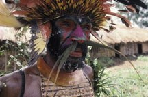
Some years ago I did a portfolio of images in Papua New Guinea. My subjects were members of volatile primitive tribes living in inaccessible highland regions of the country. The work was not without risk, but I decided to concentrate on gritty close-up shots of highly decorated faces – tribal identities that will surely soon disappear. My objective was to reveal the dignity and humanity of the people through the brutal reality of their hard lives. I therefore incorporated into the images numerous less-than-attractive characteristics such as torn clothing and neglected teeth. The processing lab saw the images in a different light, perhaps closer to formal portraits, and wanted to retouch and tidy up the rough edges.
Eventually, as style and personal interests develop, others come to recognize the mark of your work. This is possibly the final piece in the jigsaw of context. Over the years I seem to have acquired a dubious reputation as a photographer of people with an "in yer face, warts and all" style. It may be justified.
Vision and simplicity
For work to progress it is necessary to have an overall vision and reasonable clarity of purpose. Successful photographers understand the impact of an image. They visualize a message as the image is composed, and decide how it should be interpreted and conveyed to the viewer. Simple images suggest the most powerful messages, and are more likely to be understood when viewers reinterpret the visual information in the light of their personal values and beliefs. Only by developing such vision can we hope to produce an image that might, for example, come to represent a particular crisis or war.
 A broader type of vision derives from clarity of purpose. Images accumulate as projects come and go, and it can eventually become difficult to see the wood for the trees. Those who view images inevitably detect uncertainty of photographic purpose arising in the mind of a photographer. Indeed, an image or photographic project without an identifiable visual message will probably fail. It will confuse those who view it, just as a poorly composed letter leaves readers unsure of what the writer intended. Without vision, clarity of purpose and the ability to interpret a subject we are lost.
It is all too easy to get stuck in a rut and follow the same unadventurous path, always framing similar pictures in the same way. At such times it is worth reviewing past work and asking how things might develop. Look for unexplored areas and identify consistent successes and failures. Ask what you saw in failed images, and how the subject might be approached more successfully. Objectivity is fundamental because exercises of this nature can be painful as well as stimulating and refreshing.
I have been through such reviews on numerous occasions, usually because of pressure exerted by forthcoming events. My first exhibition was selected from images acquired years earlier, and brought me face to face with unseen aspects of my work. Consequent recognition of personal strengths and weaknesses proved to be the catalyst for beneficial change.
Special qualities
A good portrait brings us uncannily close to a real human being. Its impact and immediacy are such that little seems to stand between the observer and the subject. Indeed, the image approaches reality. So what are the hard-to-define special qualities that elevate the finest images to such levels? Photographers talk about pizzazz, zing and the x-factor, but what does this really mean in terms of photographing people? A definitive statement would undoubtedly be useful, but in practice there are too many different subjects, styles and techniques to consider.
However, whilst accepting that any effort in this direction will be incomplete and imperfect, there is no reason to evade the matter. So, in no particular order of merit, and complete with gaps, wrinkles and appropriate health warnings, a few suggestions follow.
Beautiful light is virtually a prerequisite for a stunning image. Those extraordinary warm colours that pass so quickly at sunset are impossible to describe in words. Bathe a model in light of this quality and the skin becomes incandescent. Use backlighting and the body is rimmed with gold. Alternatively, go out at dawn when the air is cool and moist, and capture the spring-like freshness of a young complexion.
 Form and texture are revealed by directional light, perhaps striking a surface at a low angle. This produces sharp contrast between light and shade. Sure winners are intimate skin texture, wrinkles, callused hands, rippling muscles, and exquisite beauty shown in fine detail. The illusion of image depth is also a product of contrast and directional light, but may be enhanced by careful use of perspective, line, shape and colour. Telephoto lenses and differential focus can be use to emphasize the separation of foreground and background.
Atmosphere and mood add emotion and meaning to an image. Lighting that conceals detail creates mystery, and backlit smoke and dust add intimacy. Soft focus, muted colours and reduced contrast give a feeling of tranquillity, and strong light and vibrant colours are cheerful.
Eyes certainly deserve a mention. Wide, round eyes, or those with a particularly interesting shape or direction, add magnetism to a portrait. Introduce emotions such as love, fear, joy or despair and you have an x-factor. If the eyes are sparkling, moist, intense, or focused like lasers that is also a plus. Vitality results from lively or mischievous eyes, from intensity, from action or movement, and from the presence of bright saturated colours. It is the feeling of expectation and immediacy produced when a subject seems about to move, and is emphasized by dynamic composition.
Asymmetrical equilibrium is achieved when an appropriately placed secondary element balances the weight or impact of an off-centre subject. The result is a sort of tension felt throughout the image.
Unusual positioning in the frame, particularly of the subject's eyes, may produce an unexpected quality as attention is drawn away to a corner or edge. When combined with strong lines and shapes, and implied lines such as the diagonal gaze of eyes directed to the corner of the frame, a powerful and dynamic composition is possible. Other lines, such as those suggested by the body, or a particular limb, can be used to create simple geometric shapes.
Finally, communication encourages the viewer to feel in contact with the real subject. It is enhanced by direct eye contact, expression, a feeling of involvement, the portrayal of mood or atmosphere, and the interpretation of a message or deeper meaning.


